On March 10th, as the number of new COVID-19 cases in Germany began to behave exponentially, we decided to take a stab at predicting the trend. The goal was to get a rough idea of how bad the pandemic would be, and how long it would last. One month later, with the power of hindsight, one thing is clear: Boy, were we off the mark!
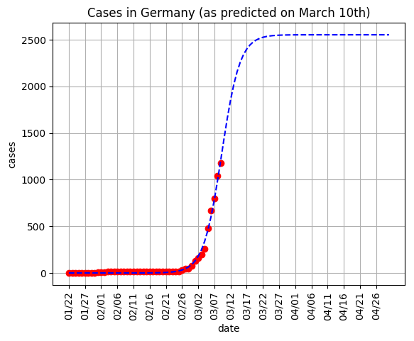
The methodology we used of fitting a Sigmoid curve to a country for which the cases had already peaked, and then scaling the curve vertically to match German data, led to an estimated maximum of roughly 2,600 cases, peaking around March 22nd.
Now, on April 8th, it looks like the cases in Germany may finally be slowing down (at least in terms of new cases per day), and the picture looks dramatically different from that which we had predicted.
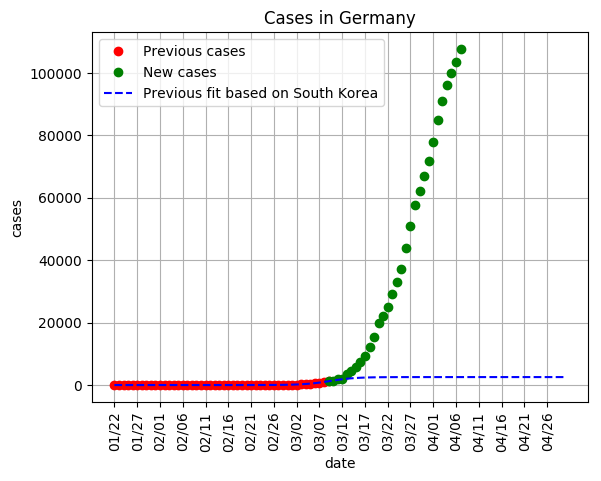
We weren’t even close! The number of cases at present is roughly 40 times higher than what we had forecast as peak! So what do we have to say for ourselves?
Well, in fact, when creating this fit last month, the true behaviour of the curve was staring us right in the face, but we simply refused to believe it. You see, on March 10th, two countries had already peaked in terms of new cases per day: China and South Korea. We initially fit a Sigmoid curve to Chinese data, and then scaled the fit to match German data. However, the resulting prediction seemed unbelievable. It suggested over 100,000 cases, only peaking around late April. Back on March 10th, when Germany only had around a thousand cases, this seemed absurd. So we chose not to believe it, and instead decided to use South Korea, which gave a much more optimistic fit.
Yet, in hindsight, that initial and grim prediction based on Chinese data was much more prescient:
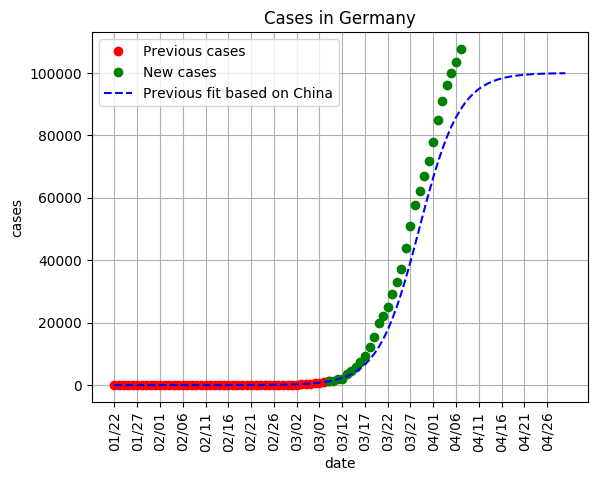
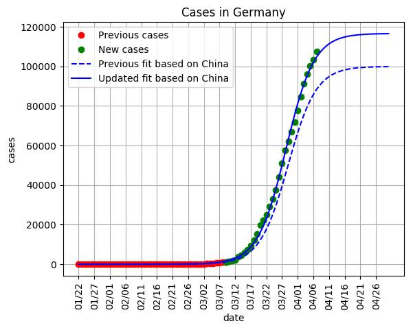
In fact, this Chinese curve was still not steep enough. If the fit is re-applied, it’s looking like the curve will peak around 120,000 cases (barring new outbreaks, which will be discussed below).

But remember, from the beginning we had no illusions that we were developing a perfectly infallible and scientifically rigorous projection. The goal was rather to make a wild guess, wait a bit, and then learn from the retrospection. So let’s do just that!
The first lesson here is the you should also listen to the data, and not try to project your preconceived expectations into shaping the outcome. This is lesson 101 in grade school science, and we’re feeling a little sheepish for having overlooked it.
The second lesson is more nuanced. You see, the South Korea fit wasn’t necessarily wrong. Rather, it showed somewhat of a ‘best case scenario’. The world is now applauding the exceptionally comprehensive measures put in place by the South Korean government, as well as the willingness of the South Korean people to voluntarily self-isolate. Germany, on the other hand, waited until March 23rd to implement serious lockdown measures, at which point the cases were past 20,000. That is to say, in terms of number of cases, the final outcome of a pandemic is only very weakly tied to the mid-way progression. The correlation is much stronger with the social distancing measures put in place. With this in mind, many groups have put together extremely rigorous models, which allow for hugely customisable projections that take into account these social factors. These are based on well-studied principles of epidemiology, and obviously eclipse the minuscule toy-model presented here.
The gold standard is perhaps the SEIR model, which can be largely customized towards a given population here.
ICL have also created a robust model.
Grant Sanderson at 3blue1brown has also created a number of exceptional simulations to explore how various different kinds of human behaviour affect the severity of a pandemic: https://www.youtube.com/watch?v=gxAaO2rsdIs
And there is a third lesson as well. Slowing the spread of a virus is one thing. Stamping it out completely is quite another. Even though, at the time of the last post, it seemed as though South Korea had vanquished COVID-19, one month later the number of cases is still (albeit slowly) trudging upwards.
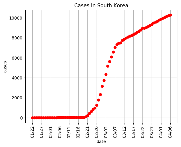
And if social distancing measures are relaxed, there is a very real chance of further exponential behaviour is case numbers. Germany has already experienced three distinct peaks in new daily cases, roughly once a week (March 20th, March 27th, and April 2nd), likely due to individuals going out more on weekends. There’s no reason to believe there won’t be more in future.
So, where does all this leave us? To summarize the lessons learned, this simple Sigmoid model does serve a function: it can show us the rough ‘best case’ and ‘worst case’ scenarios for a given country. However, to know exactly where the curve will lead, more sophisticated epidemiological models, which account for social behavoiur, are (unsurprisingly) needed.
We hope you’ve enjoyed this unfortunately steep learning curve (pun intended). As before, huge thanks to Johns Hopkins University for putting together the data, and Databricks for providing the infrastructure on which said data was crunched. Stay home and keep washing your hands!

